Article: Chapter 1: Everything You Need to Know About the Watch Dial

Original Vintage Chronographs
HERO DIVER COLLECTION
Article: Chapter 1: Everything You Need to Know About the Watch Dial
Quick Answer
A well-designed watch dial balances three elements: proportion, negative space, and hierarchy. Master these three principles and you'll instantly understand why some dials stop you in your tracks, and others simply don't.

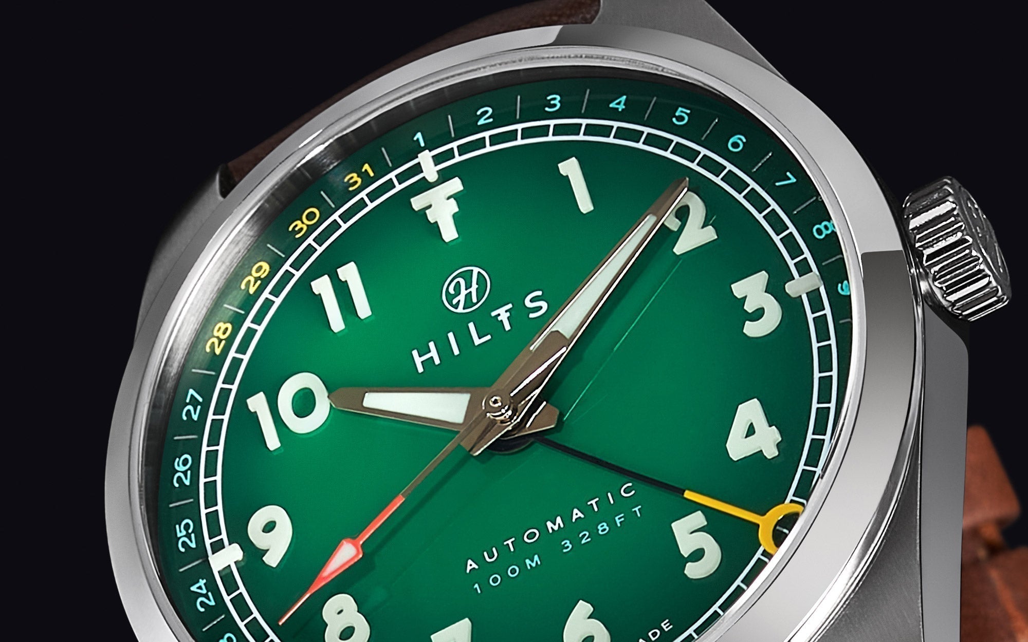
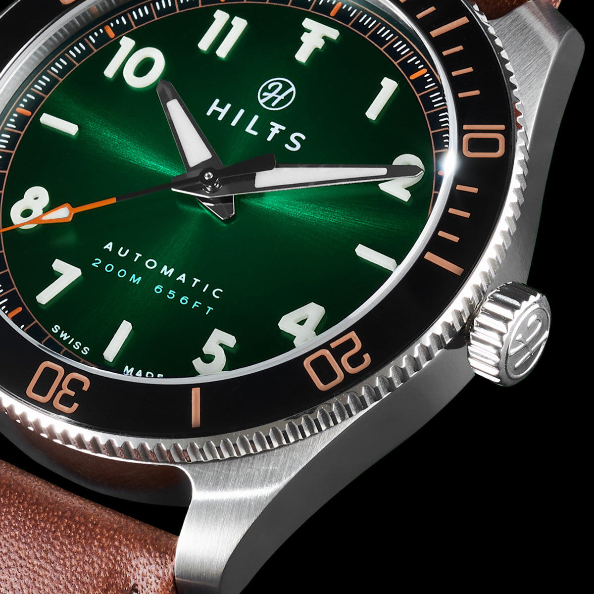
Proportion
Proportion is the relationship between the hands, the indices, and the dial itself. When it's right, everything feels inevitable, as though the dial couldn't be any other way. When it's wrong, something nags at you even if you can't name it.
The hour hand should reach roughly to the inner edge of the hour markers. The minute hand should extend to, or just past, the minute track. The second hand, if present, should reach the outermost edge of the dial. The indices themselves should occupy roughly 15–25% of the dial's radius. None of these are rigid rules. But depart from them without good reason and the dial will feel unresolved.

Negative Space
Negative space is what isn't there. The empty areas of the dial, and the breathing room they create.
The best dials use emptiness deliberately. A field watch with nothing but numerals and hands. A dive watch with applied indices at 12, 3, 6, and 9, and simple dots for the rest. A dress watch with only baton markers and no superfluous text. In each case, the restraint is the point. Negative space gives the eye somewhere to rest, lets the important elements stand forward, and creates the kind of calm that a cluttered dial never can.
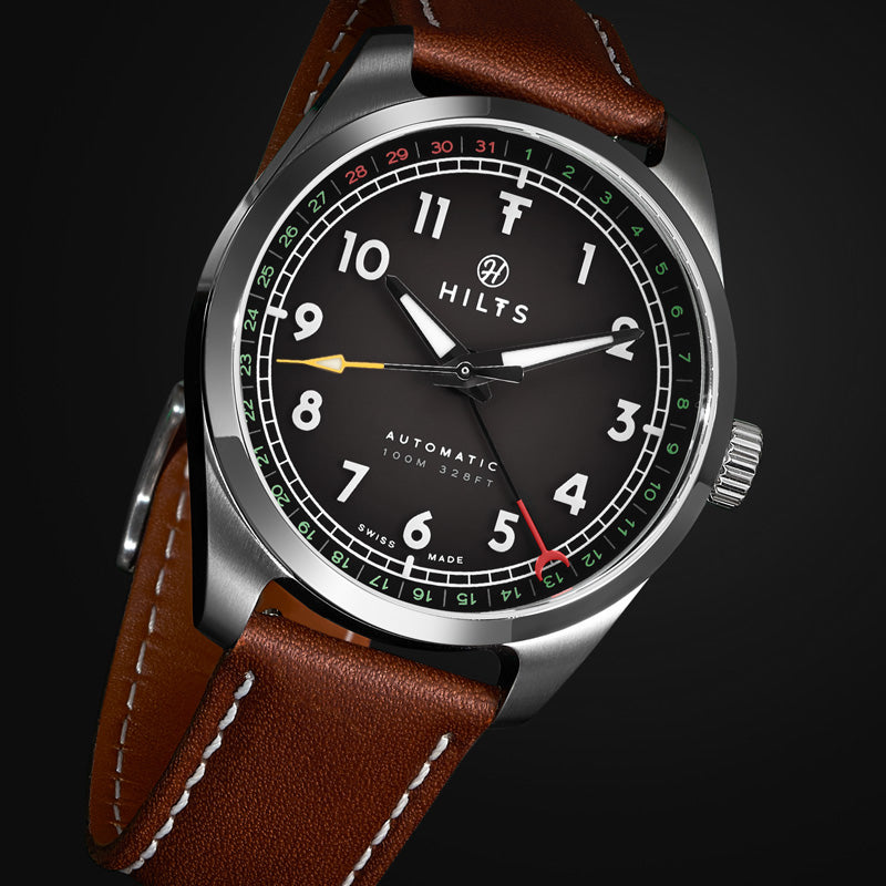
Hierarchy
Hierarchy is what you notice first, second, and third.
On a well-designed dial, the time is always primary. Everything else; date windows, sub-dials, brand text, exists to support the main function, not compete with it. The hands come first. Then the hour markers. Then any complications. Then the brand name, small and unhurried, sitting quietly out of the way.
When hierarchy breaks down, the dial becomes a conversation nobody wins. When it works, reading the time feels effortless, because the dial was designed to make it so.
You'll start to see why some dials work and others don't.
And once you see it, you can't unsee it.
Three things: proportion (the relationship between hands and indices), negative space (empty areas that give the eye room to rest), and hierarchy (the time should always be the first thing you notice). A well-designed dial balances all three elements so you can read the time at a glance without consciously thinking about it.
Negative space refers to the empty areas of a dial; the parts with no text, markers, or complications. Good dial design uses negative space deliberately to prevent visual clutter and make the time easy to read.
Ask yourself: What's the first thing your eye notices when you look at the dial? If it's the hands and the time, the hierarchy is good. If it's a large brand logo, busy complications, or excessive text, the hierarchy is poor; the dial is prioritizing branding or features over its primary function: telling time.
Simple, high-contrast designs with clear negative space. Think field watches (large numerals, minimal text) or classic dive watches (applied indices at key positions, clear hands). The best dials let you read the time in under a second, even in low light or at an angle.

Chapter 2: The Case for Complications
A complication is any watch function beyond hours, minutes, and seconds. A complication adds value when you actually use it and it's integrated into the design.
Read more
Want All The Chapters?